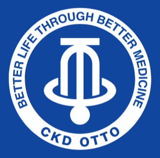
Symbol Mark
Exploring the Meaning of the CKD OTTO Pharma

The CKD OTTO symbol mark serves as a visual representation of the philosophy and image of the joint pharmaceutical corporation between Korea’s Chong Kun Dang and Indonesia’s Otto Pharmaceutical Industries, functioning as the core of all internal and external visual communications. The symbol mark creates unity within the organization and serves as the most critical communication element representing the company’s image externally.
The shape of the symbol mark signifies the future and the world. This corporate symbol internally creates a sense of belonging and acts as the most important communication element that represents the corporate image outside the company.
Logo Type
Characteristics of Our Logo Type
The logotype serves as a crucial foundational element, alongside the symbol mark, for conveying CKD OTTO’s image. It is designed to harmonize with the image projected by the symbol mark and has been proportionally adjusted to match the typeface characteristics.


Corporate Signature
Characteristics of Our Corporate Signature
The CKD OTTO combination logo represents the most rational and systematic combination of the basic symbol and logotype for CKD OTTO identity formation. It signifies the company’s official designation and serves as the most direct means of establishing corporate image recognition.


Corporate Color
Behind Our Corporate Colors
CKD OTTO’s core color principles are based on positive usage of CKD Blue applied on a white background. Color serves as a critically important element in forming the company’s visual image. Through color, CKD OTTO expresses its unique character and delivers a unified brand image, requiring precise management.

Blue
CMYK : C100 + M85 + Y0 + K0
RGB : R0 + G56 + B 148

Black
RGB : R35 + G24 + B21

White
RGB : R 255 + G 255 + B255

Silver


